



Portfolio 2026

I turn complex systems into simple, scalable digital products.

10+ years designing complex platforms, multi-step workflows, mobile applications and design systems.

Julius Masaitis portfolio
10+ years of experience
50+ projects delivered
6 different industries

Along the way

Elektroniniai valdzios vartai LTOK Rheem Genius Sports

Selected work

GovTechE-System2025–2026

E-Government Gateway

Rebuilding Lithuania's national public services portal and shaping its first mobile app.

Challenge

The legacy system was built nearly 20 years ago and no longer met modern user needs — slow performance, an outdated technical foundation, and a user experience that hadn't evolved alongside the scale and complexity of services the portal had grown to host. The platform urgently needed a full modernization: not a surface-level redesign, but a rebuild from the ground up, re-architected for resilience — so that if one part of the system were to fail, the rest could continue operating without disrupting citizens' access to essential public services.

Outcome

Rebuilt from the ground up for resilience and longevity, the new platform now operates at national scale — 4,758 active users, 28,131 daily logins, 23.5M logins this year, and 3,700 published services across dozens of government institutions. Two parallel discovery paths (life events + service categories), faceted search, and tabbed service pages replaced the outdated interface, while a new personalization layer lets citizens subscribe to notifications tied to their own life events.

Context

Elektroniniai valdžios vartai (epaslaugos.lt) is Lithuania's central portal for administrative and public e-services, connecting citizens and businesses to government agencies (managed by VSSA — the State Digital Solutions Agency). The platform hosts thousands of services across dozens of institutions, serving a broad range of users — from young parents declaring a birth to businesses applying for regulatory permits.

Design principles

  • Life-event-first navigation — organizing services around real user situations rather than institutional silos
  • Dual entry points — parallel access via life events and traditional service categories
  • Structured, filterable search — faceted filters and clear service tagging to cut through hundreds of listings
  • Transparent service detail pages — tabbed structure separating description, process, documents, and cost
  • Granular personalization — notification/reminder settings scoped to specific life events
  • Trust and accessibility — consistent EU/ISO trust badges, accessibility toggle, and LT/EN language support

Walkthrough

scroll
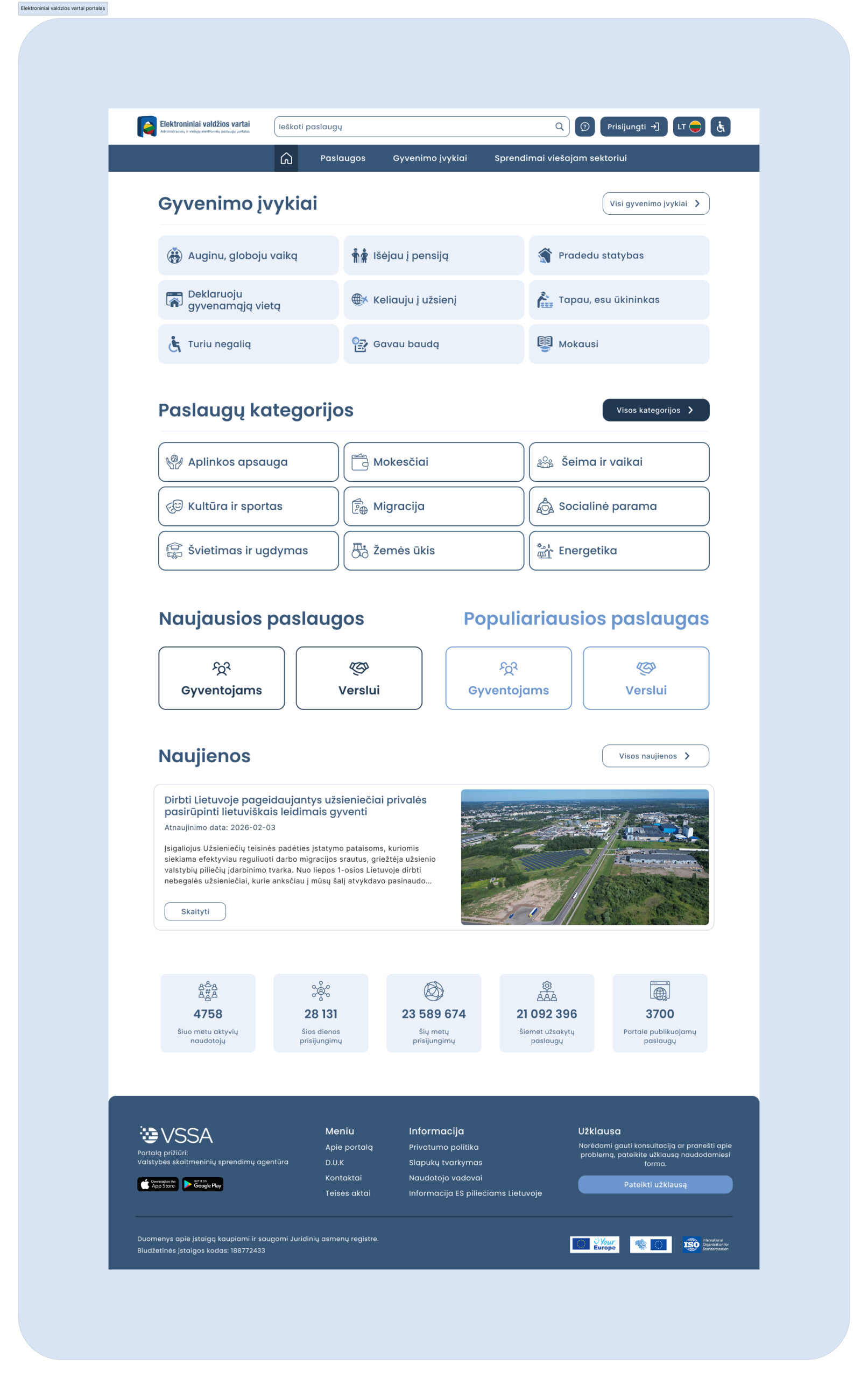
Homepage

Reframes the portal's entry point around user intent rather than institutional structure, surfacing life events, service categories, and platform activity in a single, orientating view.
scroll
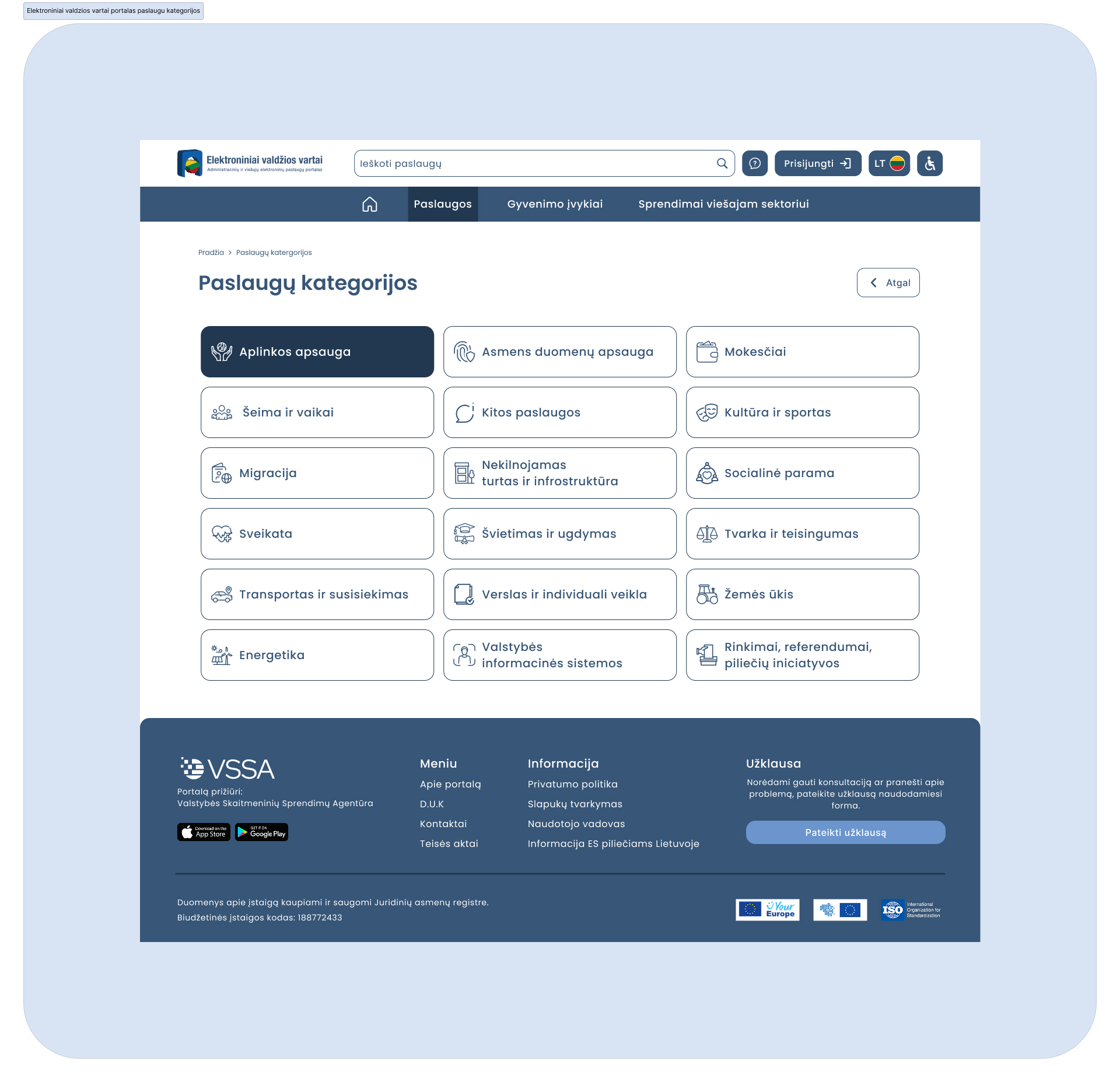
Life Events

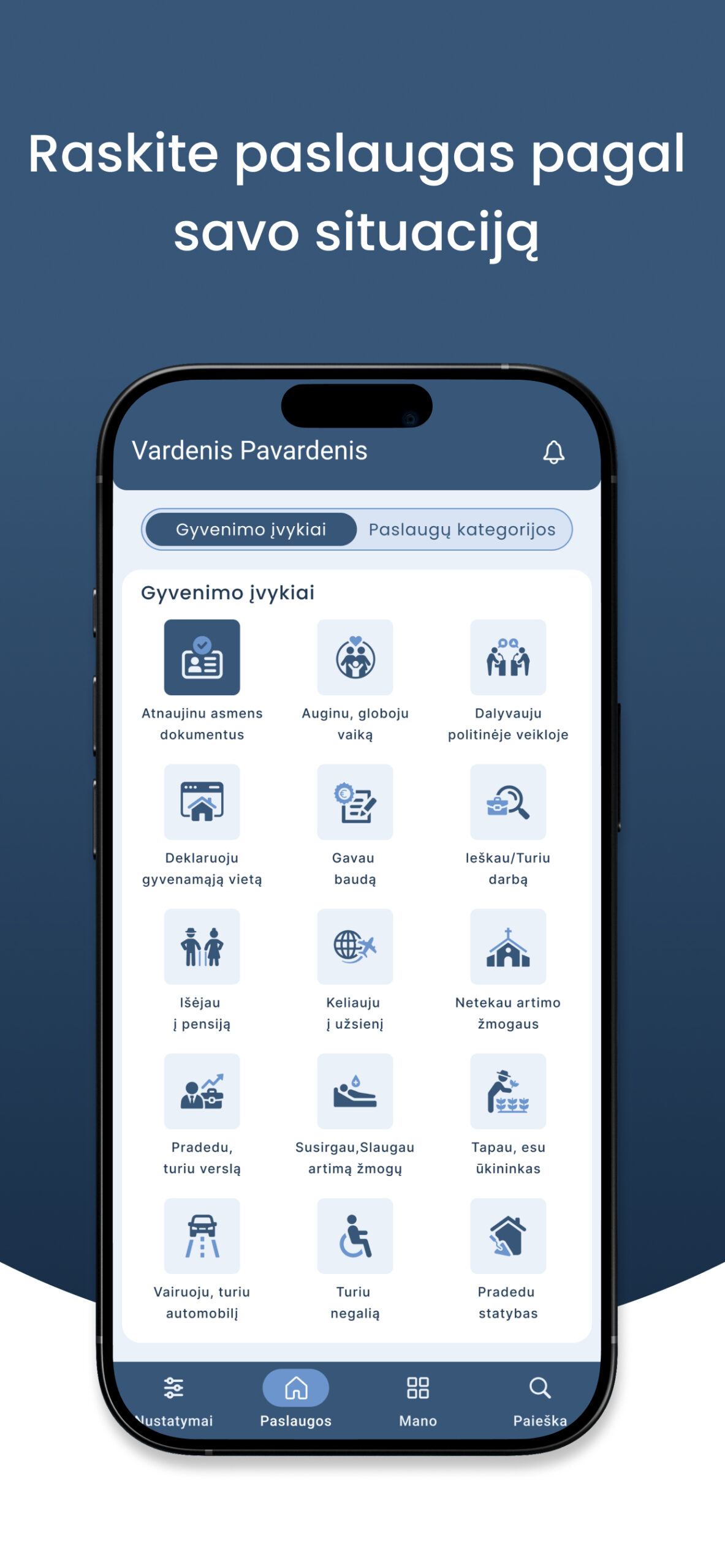
Recasts navigation around real-world situations — raising a child, retiring, starting a business — so users can find what they need without first knowing which agency owns it.
scroll
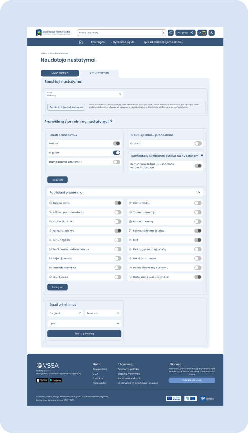
User Settings

Notification and reminder preferences tied to individual life events, giving users control over what reaches them and when — rather than a single blanket subscription.
Results

28,131 daily logins — up 35% since the redesign launched.
3,700 services ordered every day.
AI productmobile appGovTech2025-2026

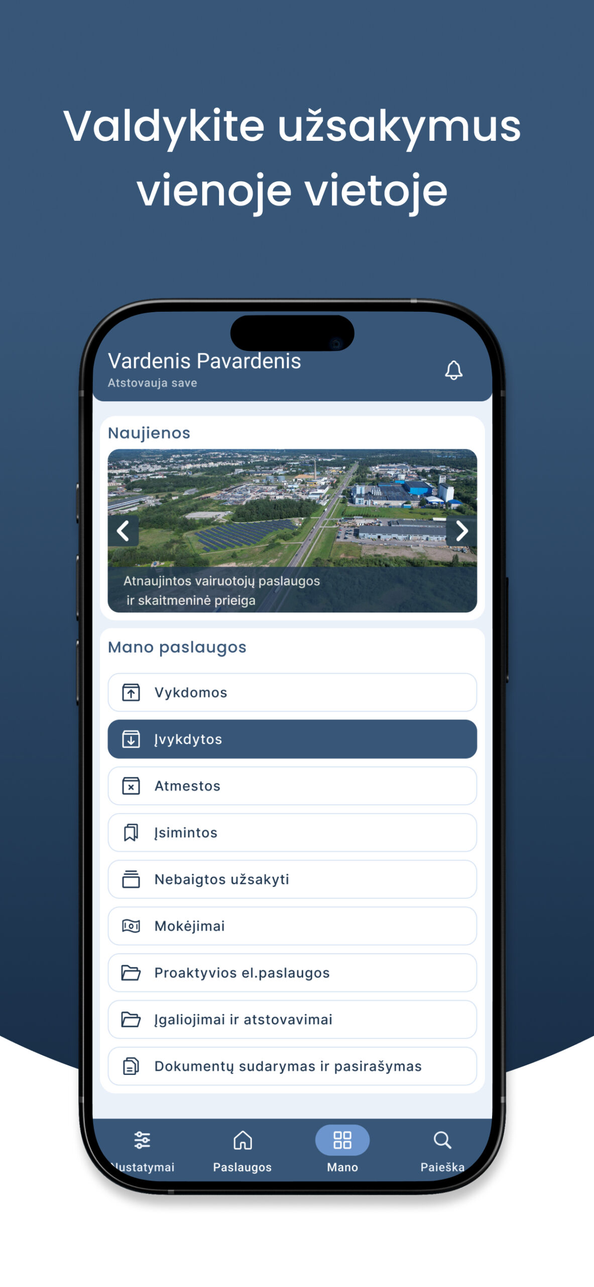
E-Government Gateway mobile app

Repositioning an AI compute product from an earnings pitch to a transparency-led experience.

Challenge

The existing mobile app was completely outdated — it hadn't kept pace with the platform's growth and failed to meet basic modern usability, accessibility, or design standards. Navigation was inconsistent with the web portal, service information was hard to parse on a small screen, and there was no clear way for users to track the status of their own requests once submitted. A full mobile redesign was needed to bring the app in line with contemporary UX expectations and mirror the structure of the newly rebuilt web platform.

Outcome

The rebuilt app brings the mobile experience to parity with the redesigned web portal — replacing an outdated, standards-non-compliant interface with a consistent, trackable, and personalized system. Citizens can now discover services by life event, monitor every stage of an order's progress, and control exactly which updates they receive — all from a native app that finally matches the scale and reliability of the underlying platform.

Context

As part of the broader modernization of Elektroniniai valdžios vartai (epaslaugos.lt), Lithuania's central e-government services portal, the redesign extended to its native mobile app — giving citizens the same access to public services, life-event navigation, and order tracking directly from their phone.

Design principles

  • Consistency with the web platform — mirroring the life-event and service-category navigation model from the desktop redesign, so users move seamlessly between web and app.
  • Personal dashboard as the core — a dedicated "Mano" (My) section consolidating ongoing, completed, rejected, and saved services, plus payments and documents, in one place.
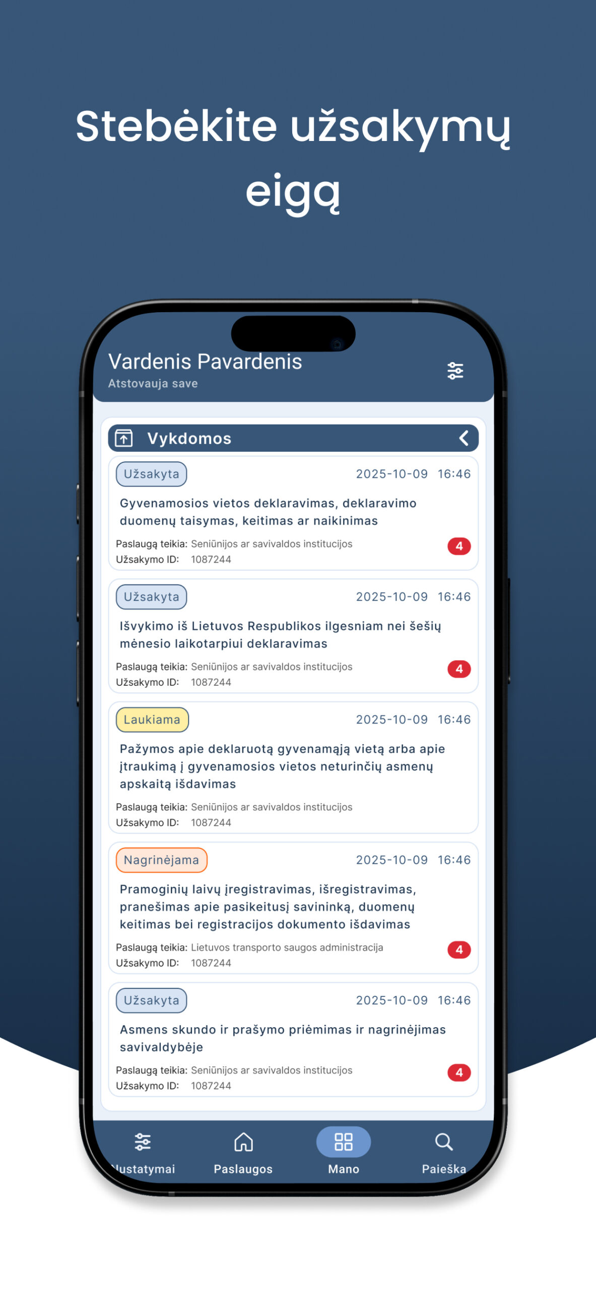
  • Transparent order tracking — clear status states (Užsakyta, Laukiama, Nagrinėjama, Įvykdyta) with timestamps, order IDs, and provider contacts visible at a glance.
  • Granular notification control — per-life-event toggles for how and where users receive updates (email, in-app), replacing blanket notification settings.
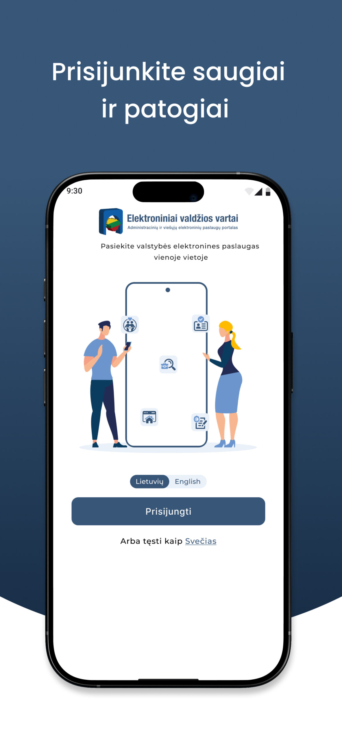
  • Secure, low-friction authentication — a clear login entry point supporting both authenticated access and guest browsing.
  • Readable service details on mobile — collapsible sections (full description, required documents, cost) adapted for small-screen scanning instead of dense desktop-style text blocks.

Walkthrough

scroll
Home

Personal dashboard consolidating ongoing, completed, rejected, and saved services, payments, and document management.

scroll
My Services

Life-event grid as the primary discovery path, with a toggle to switch to category-based browsing.

scroll
Order Details

Full order breakdown — status, ID, timestamps, recipient, provider contacts, and downloadable documentation.

Website2024

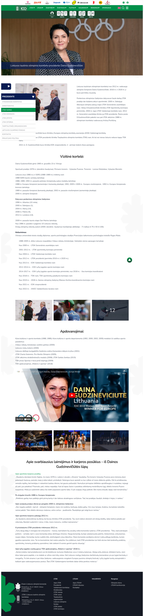
Lithuanian National Olympic Committee (LTOK)

Redesigning the digital home of Lithuania's Olympic movement.

Challenge

LTOK is not a typical sports media platform. The website needed to serve several different audiences at once: sports fans, athletes, journalists, young people, educators and members of the wider Olympic community.

Outcome

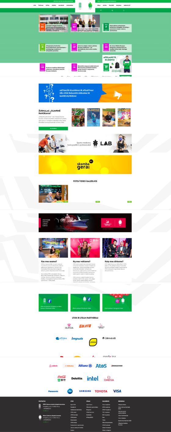
The new experience was built around content discoverability and visual storytelling. Instead of treating every section as an isolated information page, the design uses a modular system of content blocks that allows users to quickly move between different areas of the Olympic ecosystem.

Context

LTOK is not a typical sports media platform. The website needed to serve several different audiences at once: sports fans, athletes, journalists, young people, educators and members of the wider Olympic community.

Walkthrough

scroll
01 — Content first

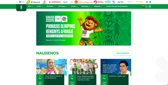
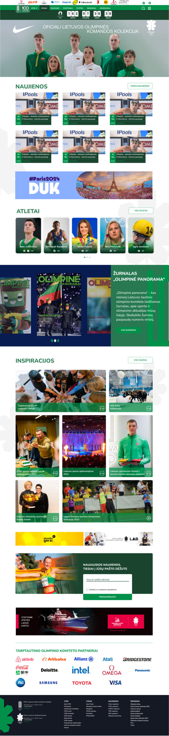
LTOK produces a large amount of content across different formats. The interface was designed to let content drive the experience. Large imagery, clear typography and modular content cards create a flexible editorial system that can support everything from breaking news to long-term Olympic initiatives. The goal was to make the platform feel closer to a modern digital publication rather than a traditional institutional website.

scroll
02 — Olympic energy without visual noise

Sport is emotional, dynamic and visually expressive. However, LTOK also represents a respected national institution. The visual language needed to balance these two worlds. I used: Strong photography Large visual moments Structured grids Restrained use of colour Clear hierarchy Generous spacing The green visual identity creates continuity across the platform while photography brings movement, emotion and personality into the experience.

scroll
03 — Make athletes part of the story

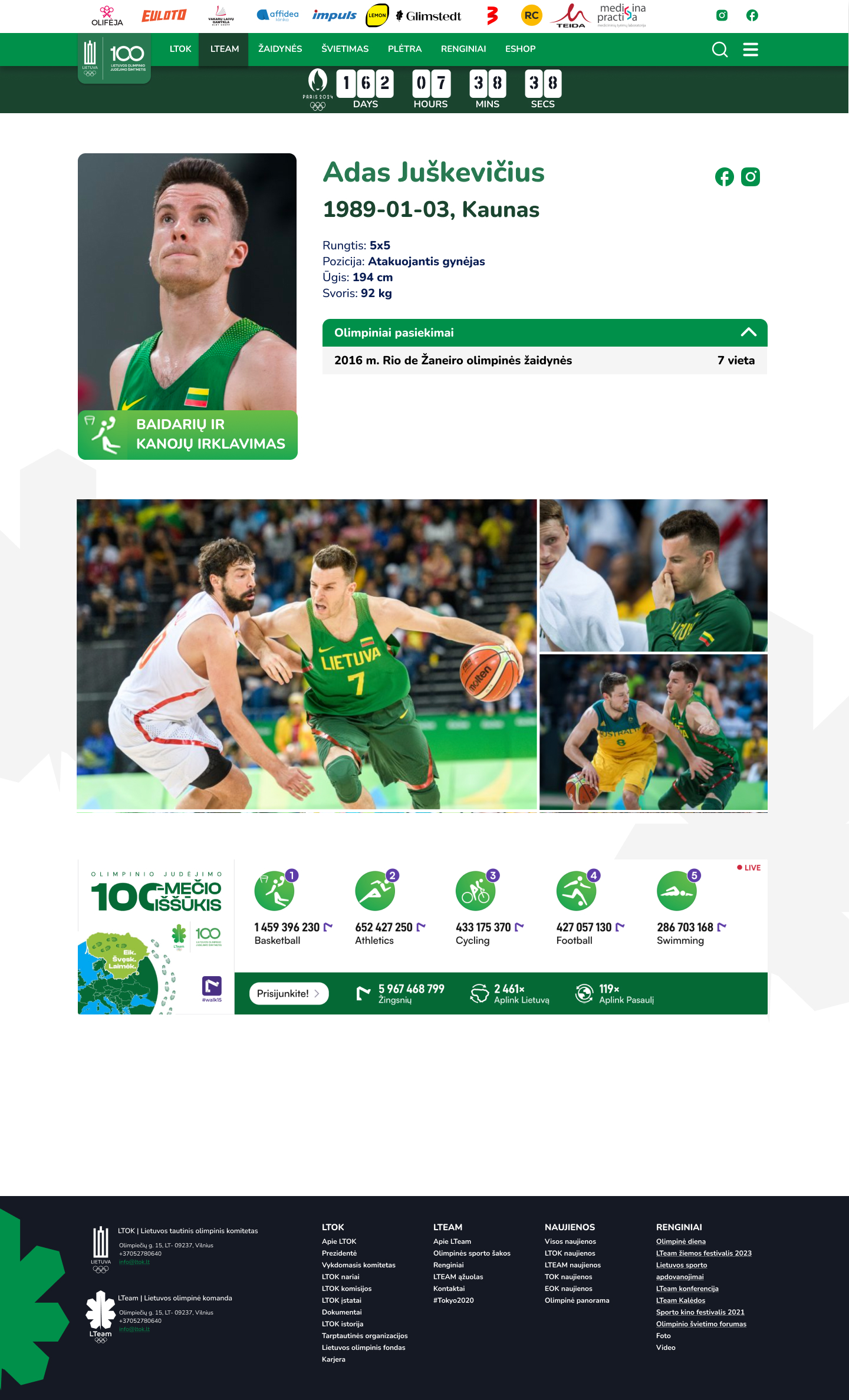
Olympic organisations are ultimately about people. Instead of positioning athletes as a separate database or secondary section, athlete content became an important part of the overall homepage experience. Dedicated athlete cards make it easy to discover Lithuanian Olympians while giving the platform a more human and recognisable identity. This approach helps balance institutional communication with the stories and personalities that audiences naturally connect with.

Before / after

Before
After
Before After

Old website and current

Results

<10 s Faster loading pages
96% recognition confidence
1 system licence, rules, map, stats
Mobile appSmarthome appSmart control2024

Rheem – Mobile App

Rethinking a Lithuanian bank's app — from flow audit to high-fidelity UI and a reasoned pitch.

Challenge

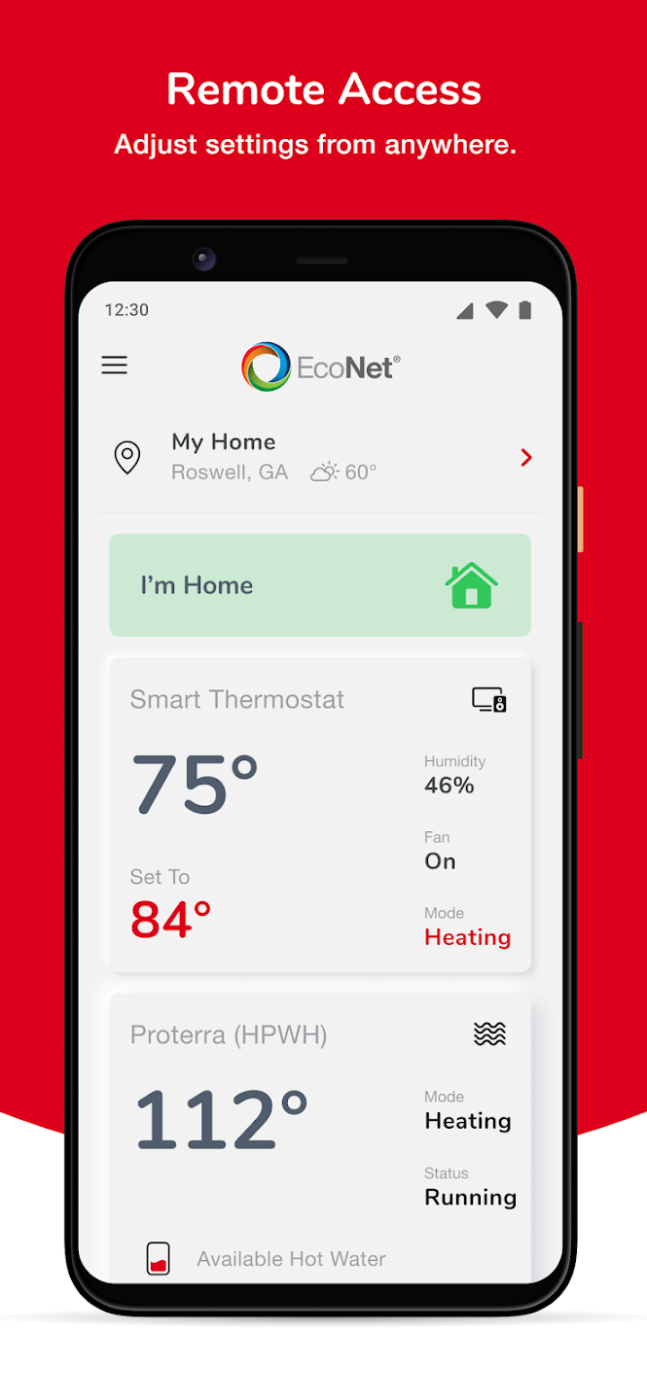
Despite that adoption, the existing interface carried a dated, visually noisy design — dense red backgrounds, cramped icon grids on the home screen, and troubleshooting flows (like "Fix It") that buried users in long, undifferentiated lists of error codes with no visual hierarchy or guidance. As Rheem's device lineup grew across multiple brands and product types (thermostats, hybrid water heaters, HVAC systems), the existing design couldn't scale — users struggled to onboard new devices, navigate between zones, or resolve issues without contacting support directly. The app needed an interface that could handle real complexity — multiple brands, multiple device types, multiple rooms — without overwhelming the homeowner using it.

Outcome

The legacy EcoNet app had reached 100K+ downloads and a 4.0-star rating across 11.4K reviews — proof of real-world adoption at scale, and the baseline the redesign needed to build on without disrupting.

Context

EcoNet is Rheem's smart home app for controlling HVAC systems and water heaters across the Rheem family of brands (Rheem, Ruud, Friedrich, Richmond, Sure Comfort, Russell by Rheem, Durastar). The app lets homeowners manage climate and hot water remotely, monitor energy usage, and automate schedules across multiple zones and devices.

Design principles

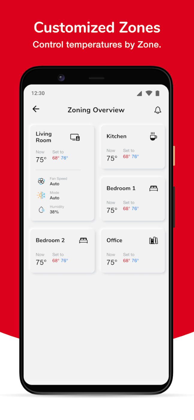
  • Zone-based control — organizing multiple rooms/devices (Living Room, Kitchen, Bedrooms, Office) into a single scannable overview instead of per-device navigation.
  • Guided device onboarding — step-by-step setup flow (Location → Connection → Customize) with visual device picker and QR code scanning to reduce setup friction.
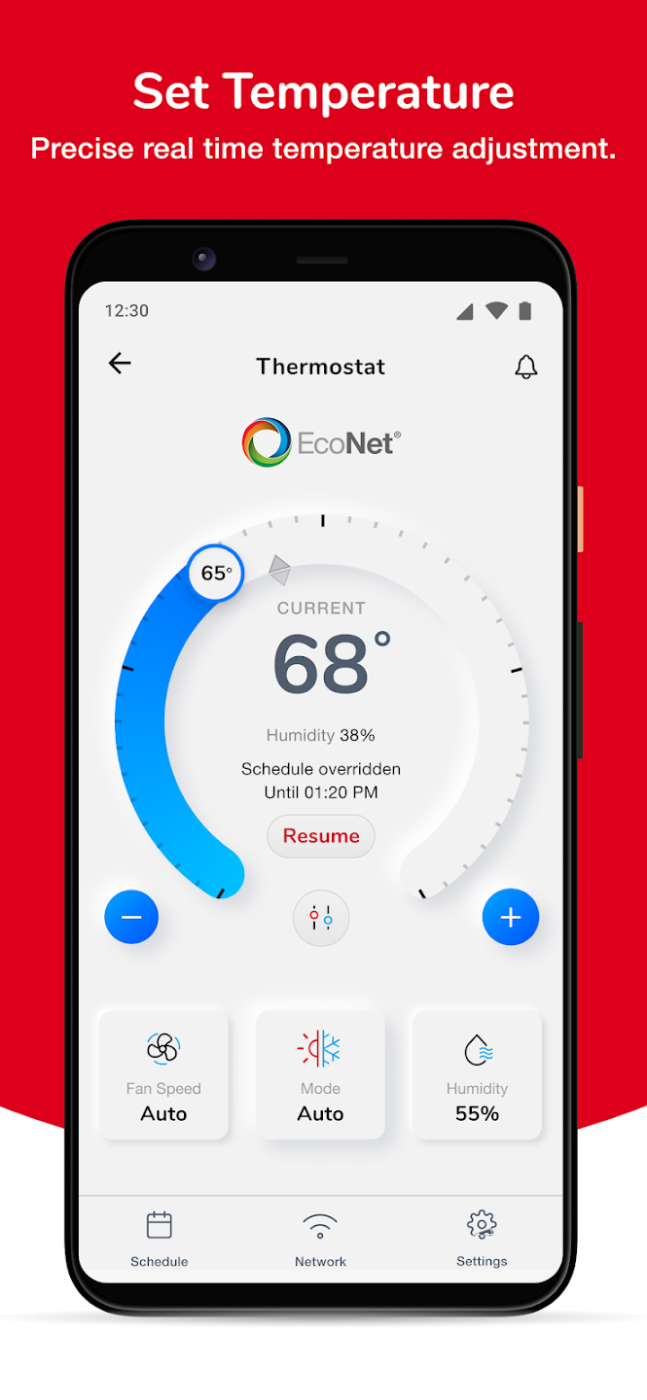
  • At-a-glance status, deep control on demand — large temperature dial as the primary interaction, with mode, fan, and humidity tucked into secondary tiles.
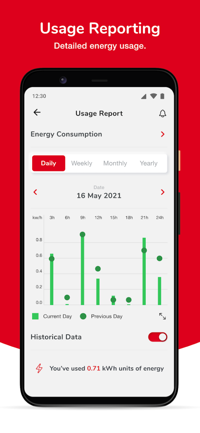
  • Energy transparency — dedicated usage reporting with daily/weekly/monthly/yearly views and historical comparison, turning raw consumption data into actionable insight.
  • Proactive guidance — contextual banners (e.g. "set to Energy Savings Mode") nudging users toward efficient settings without forcing a decision.
  • Consistent brand system — a unified red/white visual language and iconography applied across every device type and brand under the Rheem umbrella.

Walkthrough

scroll
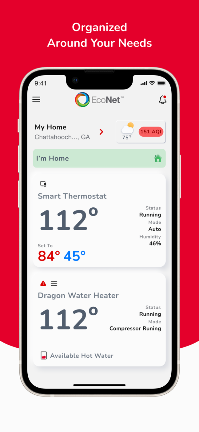
Remote Access (Home)

Central dashboard showing all connected devices, live readings, and quick "I'm Home" mode toggle.

scroll
Set Temperature

Primary thermostat control with real-time dial adjustment and schedule-override state.

scroll
Customized Zones

Multi-room overview letting users monitor and adjust each zone independently.

scroll
Usage Reporting

Visual energy consumption breakdown with historical comparison and unit totals.

Results

4.5 stars better aplication rate than before
100K+ Double downloads only for android
350K+ Triple downloads only for iOS