E-Government Gateway
Rebuilding Lithuania's national public services portal from the ground up, and shaping its mobile app, around life events instead of institutions.

At a glance


01 Problem
A 20-year-old portal could no longer carry a country's public services.
GoalMake public services findable by what people need, not by which agency owns them.
Challenge
Built nearly 20 years ago, the legacy portal was slow and technically outdated, and its experience had not kept pace with its scale. It needed a ground-up rebuild, re-architected so one failure could not take everything down.
Outcome
The rebuilt portal carries national-scale traffic: 28,131 daily logins, 23.5M logins and 21M+ services ordered this year. Daily logins are up 35% since the update.
Elektroniniai valdžios vartai (epaslaugos.lt) is Lithuania's central portal for public e-services, run by the State Digital Solutions Agency. It connects citizens and businesses with dozens of institutions, from a young parent declaring a birth to a company applying for a permit.
02 Users
From a young parent declaring a birth to a business applying for a permit.
03 Process
One structure for web and mobile, built on a new design system.
Finding a service
4 steps- 01 Arrive with a need GoalFind the right service FrictionNavigation follows institutions, so you must know the agency
- 02 Search GoalNarrow down hundreds of services FrictionResults without meaningful filters
- 03 Open a service GoalUnderstand what is required FrictionDocuments, cost and duration mixed into dense text
- 04 Order GoalStart the request FrictionLittle sense of what happens next
The old structure mirrored the institutions, not the people using them.
New web portal
5 steps- 01 Arrive GoalLife events or categories, two parallel entry points
- 02 Narrow down GoalFilter by category, provider, life event, price, audience
- 03 Read the service page GoalTabs for description, process and more info; documents, cost, duration
- 04 Order GoalA direct order action on the page
- 05 Stay informed GoalNotifications scoped to your own life events
Everything a person needs to decide is on one page.
Mobile app
5 steps- 01 Open the app GoalLife events first, with a switch to categories
- 02 Read a service GoalCollapsible sections for description, documents and cost
- 03 Order GoalA persistent order button
- 04 Track in Mano GoalOngoing, completed, rejected and saved services in one place
- 05 Control updates GoalPer-life-event toggles and channels
The app mirrors the web structure, so citizens do not relearn it.
Order statuses
4 steps- 01 Ordered GoalRequest received (Užsakyta)
- 02 Pending GoalWaiting for the provider (Laukiama)
- 03 Under review GoalBeing handled (Nagrinėjama)
- 04 Completed GoalDone (Įvykdyta)
04 Decisions
Two ways in, so first-timers and regulars both find their way.
- Life events first, categories alongside People arrive with a situation, while regulars still want direct category access
- A rebuild, not a reskin A 20-year-old foundation could not be fixed from the surface
- Modular, resilient architecture If one part fails, citizens still reach essential services
- Service pages with documents, cost and duration upfront People know what to expect before they start
- Notifications scoped to life events A blanket subscription sends irrelevant updates
- One structure for web and mobile Citizens move between the two without relearning
05 Solution
Services organised around life events, not institutions.
- Life-event-first navigation: services organised around real situations, not institutional silos
- Dual entry points: life events and service categories side by side
- Structured, filterable search: faceted filters and clear tagging across hundreds of listings
- Transparent service pages: description, process, documents and cost clearly separated
- Granular personalisation: notifications scoped to specific life events
- Trust and accessibility: EU and ISO trust badges, accessibility toggle, LT and EN

An entry point built around intent
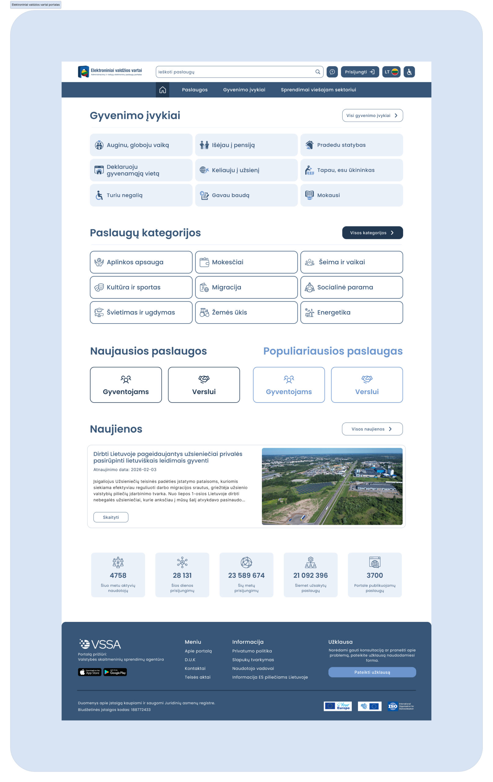
The portal now opens on what people need: life events, service categories and live platform activity in one orienting view, instead of an institutional map.
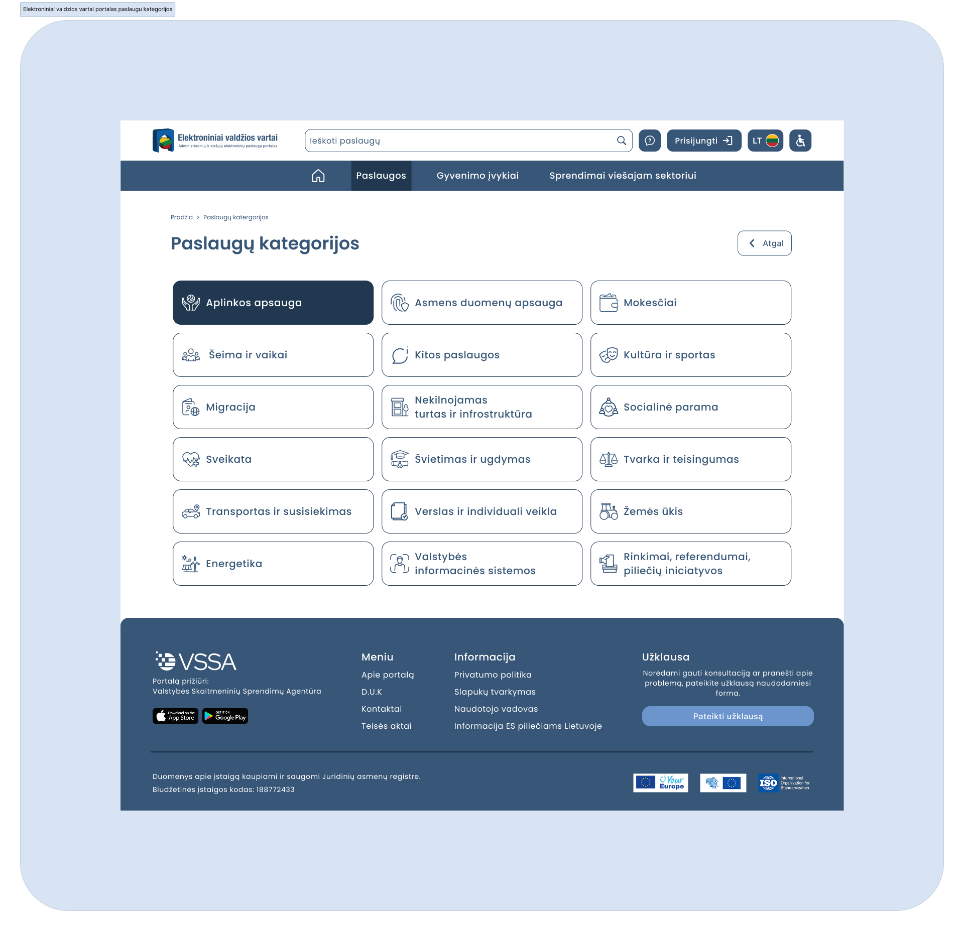
Structure for hundreds of services
Faceted filters narrow the catalogue by provider, cost, audience and life context, while categories stay as a second path for people who know what they want.
A legible, actionable service page
Description, process and requirements are separated, so a dense bureaucratic listing becomes clear: what is needed, what it costs, how long it takes.
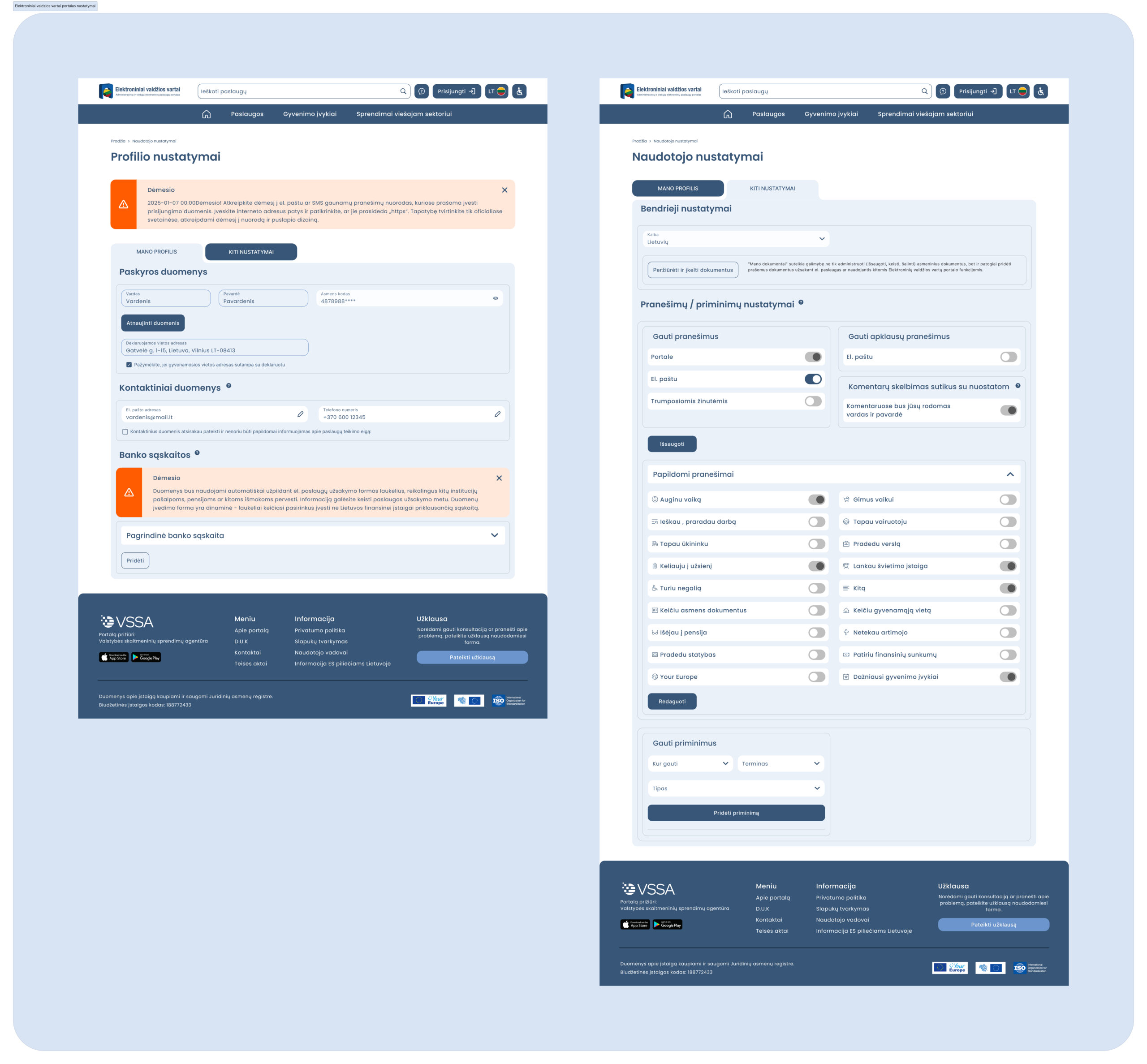
Control over what reaches you
Notification and reminder preferences are tied to individual life events, instead of a single blanket subscription.
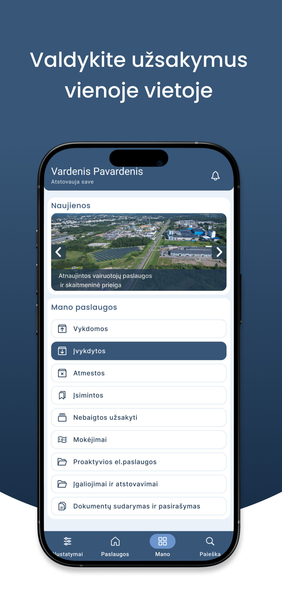

The same structure in your pocket
Life events lead, and Mano consolidates ongoing, completed, rejected and saved services, payments and documents in one place.
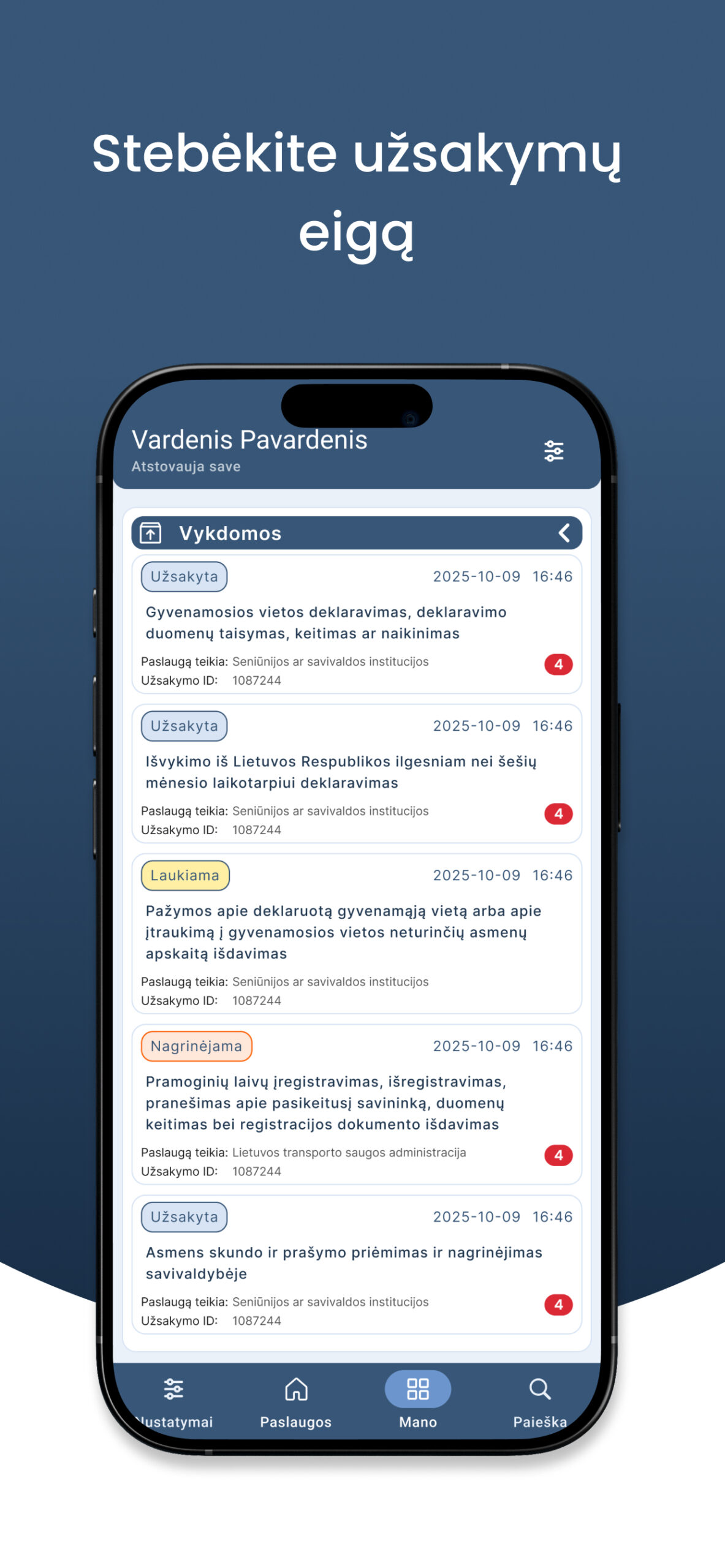

Every request, at a glance
Each order shows its stage, ID, timestamps and provider contacts, with documents available to download.
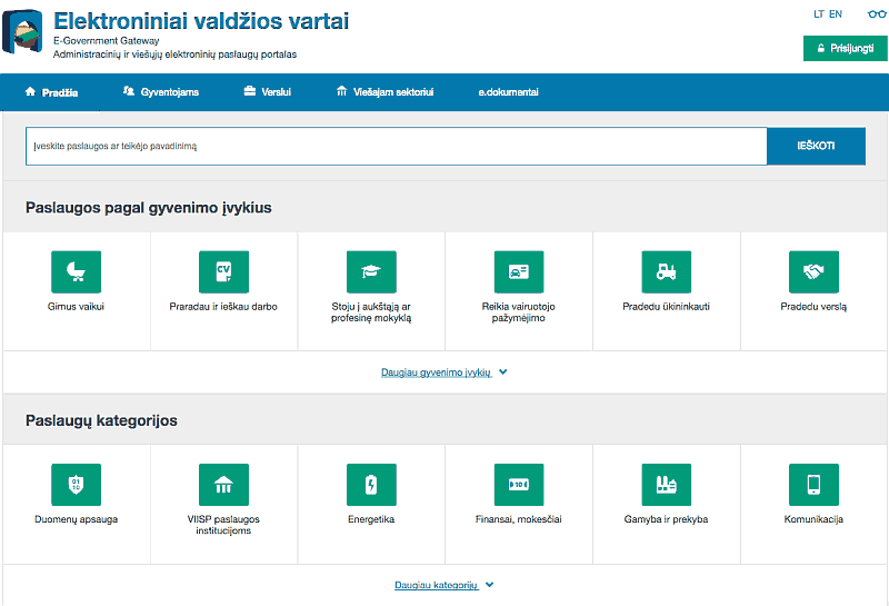
The portal homepage before and after the rebuild.
06 Results
The rebuilt platform carries national-scale traffic.
Portal live statistics, 2026. The 35% compares 2024-2025 before and after launch.
A rebuild at national scale is a product programme, not a visual refresh. Two ways in beat one clever one: people with a situation and people with a destination both need a path.